Paths for Everyone report

Sustrans

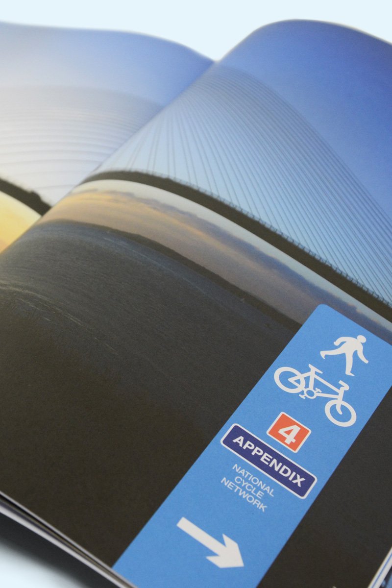
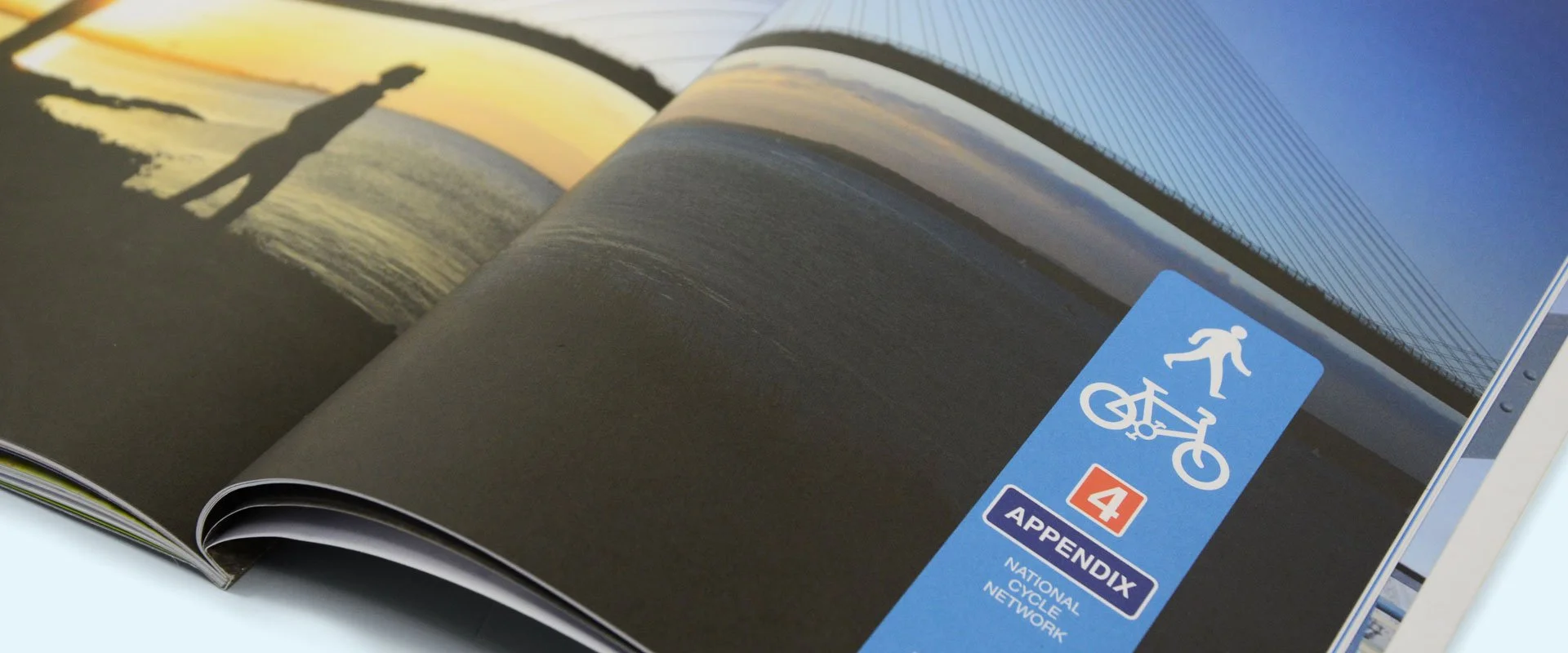
A photo showing an open page of the Paths for Everyone report showing a divider with a view of someone walking the path overlooking the Severn Bridge
Graphic design to show the value of the NCN in a report to raise development funds. Structured layout, report design, photography and custom graphics all help to bring the story to life.

It was an honour to design this report for Sustrans. It’s purpose was to support a request for funding from Parliament for £2.8 billion over 22 years to invest in the National Cycle Network. It is the result of two years work done by Sustrans to present this proposal.

Products: Printed report
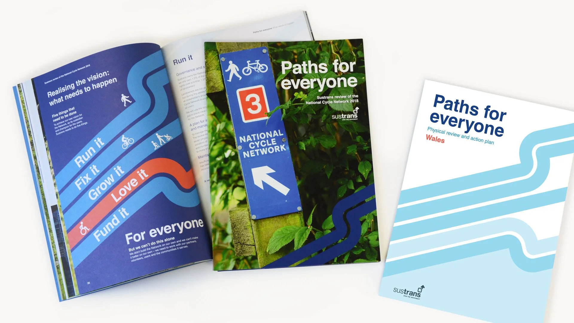
The report formed a bundle of documents inside an outer containing the report and area action plan documents. Graphic elements were used to tie all three pieces together.
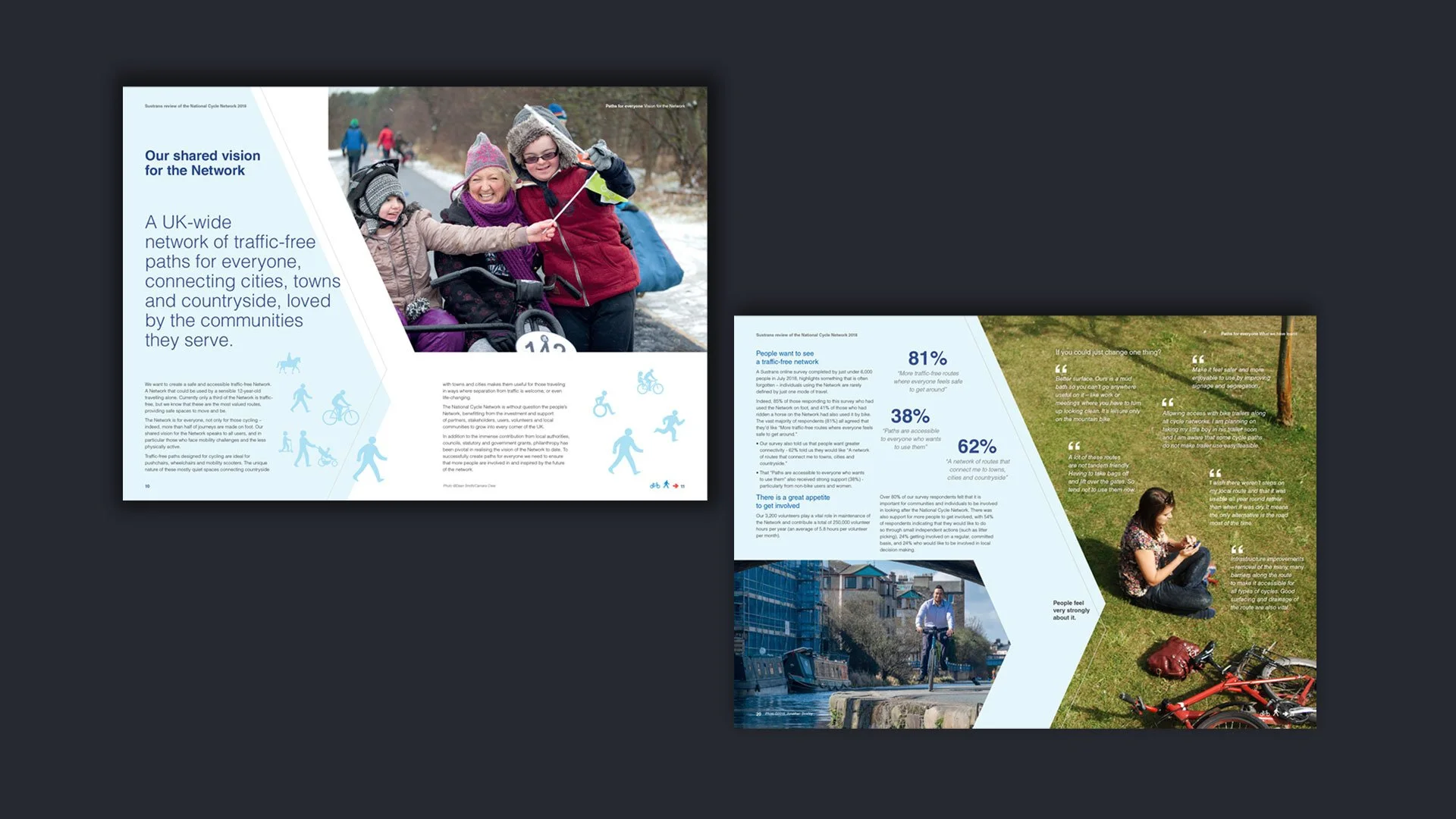
Graphic design gave the pages an energetic feeling, using icons, quotes and photography to give the content shape.

On the Network, signage uses the UK motorway signage branding designed in 1958 by typographers Jock Kinneir and Margaret Calvert: now the standard for this type of signage that we see everyday. The design challenge was to work with this universal timeless classic brand, designed to be seen at a distance, but to adapt it to be seen close up in your hands, including in the graphics to help get the messages across.

The London Underground branding design was inspiration to help with the graphic elements to keep the timeless feel of those transport brands. The beautiful photography, provided by Sustran’s and its associated organisation’s, was also amazing to work with.
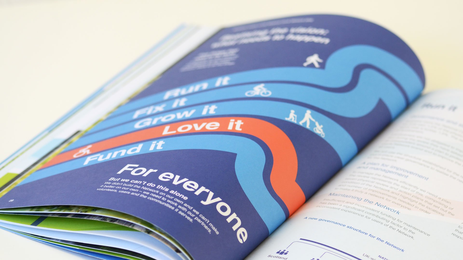
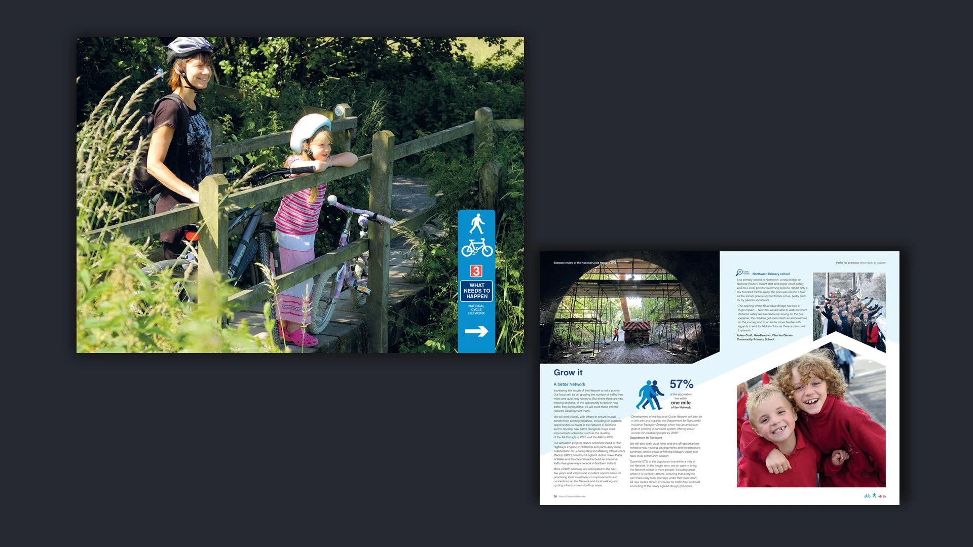
A full page graphic designed to introduce the following sections of the Paths for Everyone report: 'Run it Grow it Fix it Love it Fund it'. Design that followed the Highways style of graphic provided a visual to hang this on.
Two pages to show how photography supported the design to reflect the value of the Network to the health and wellbeing of the community
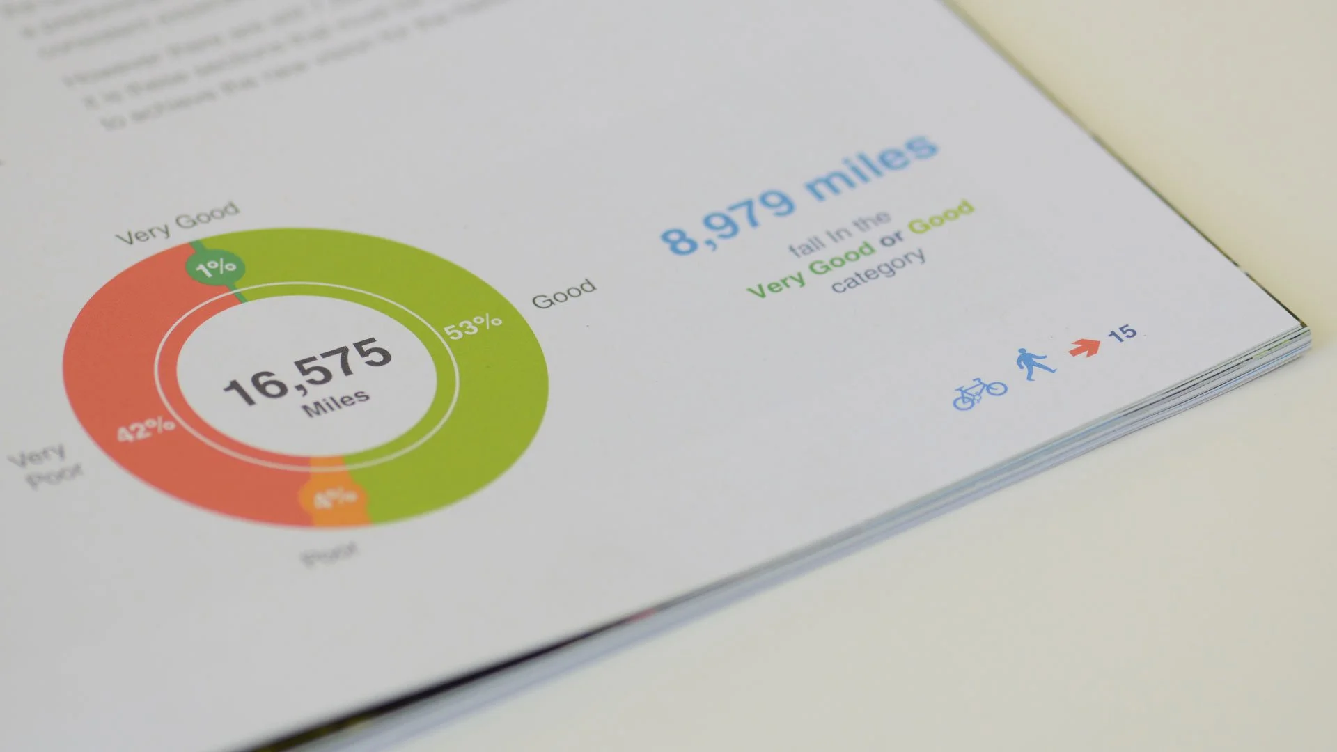
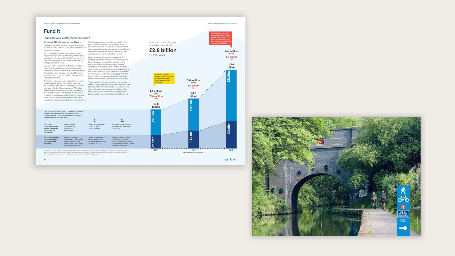
Design that makes data more friendly and visual to make it quick and light to grasp.
Design made the main data for the projection of users and the financials into a large infographic to hang all the pieces of information together showing projected progress over time.
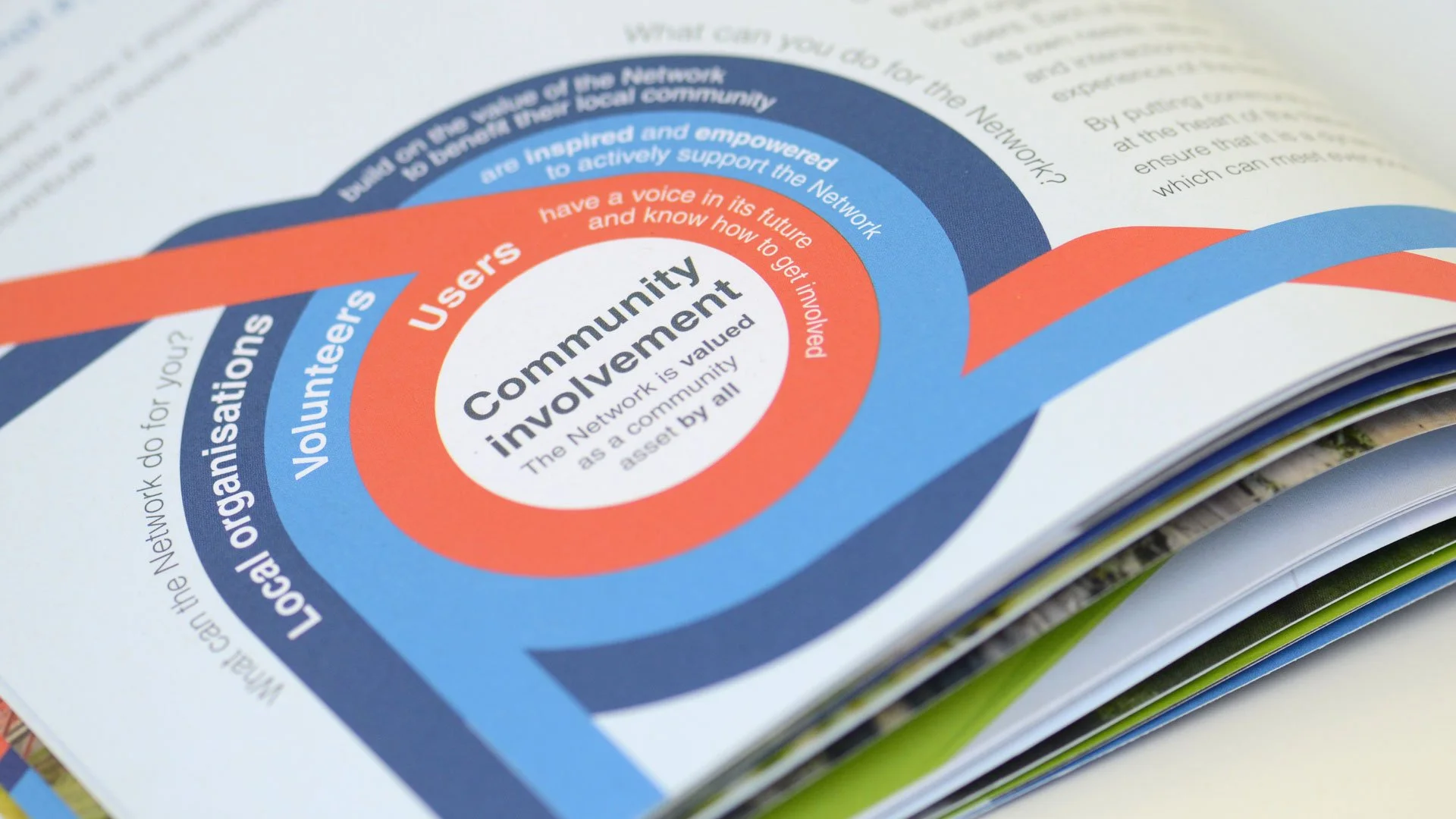
A designed graphic that gives a nod to other transport brands to create a structure for community involvement in a useful asset.

More case studies you might like