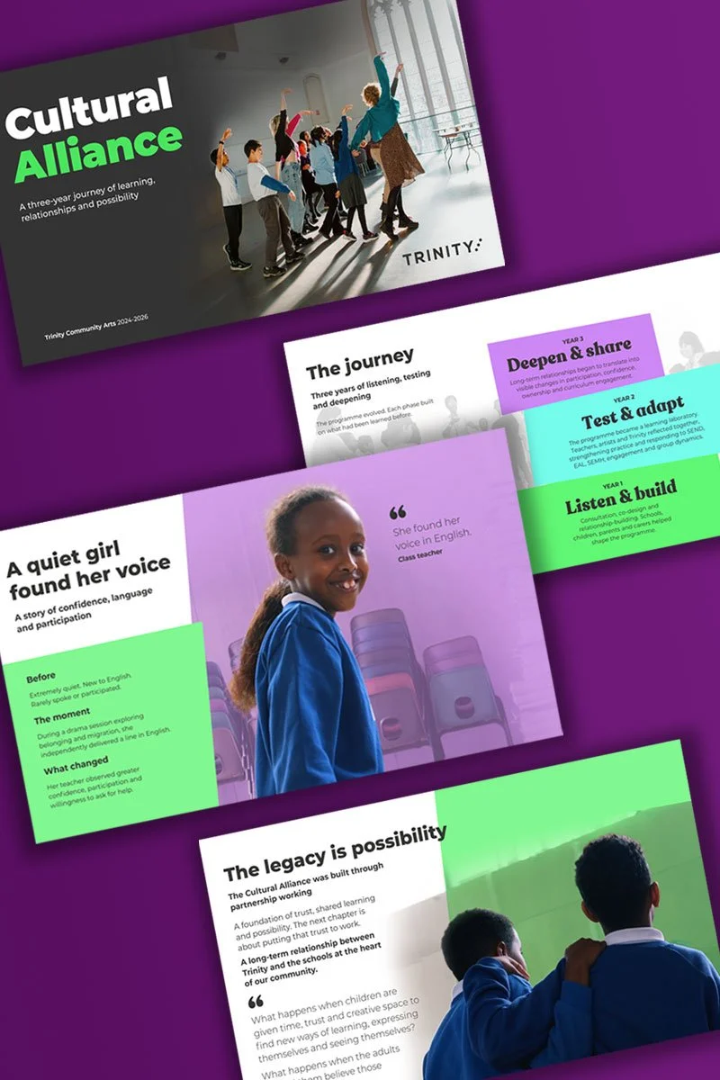
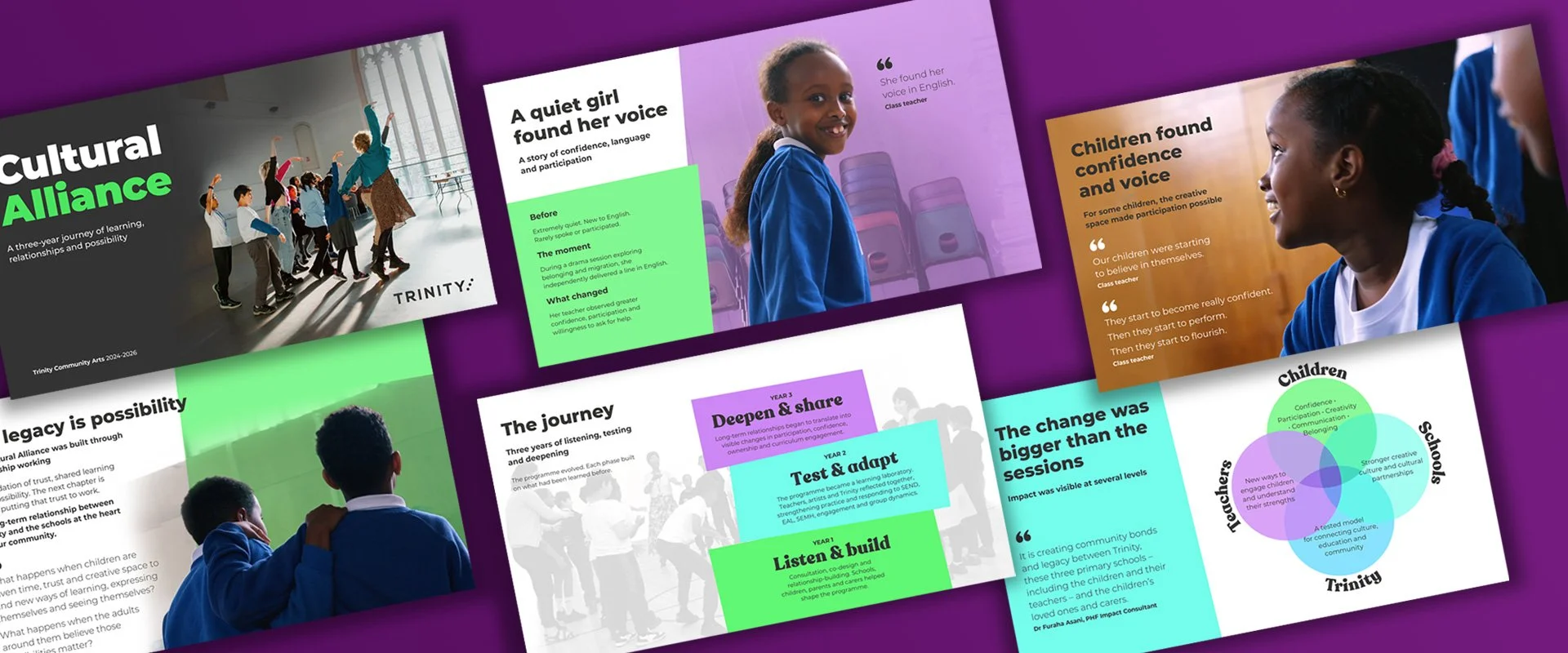
Promotional flyer for Cultural Alliance program featuring children engaging in activities, with sections on their journey, impact stories, and program values, using bright colors and images of children in classrooms.
The colour, photography, graphics and fresh colour are key to highlighting the story of what the Cultural Alliance programme does.

Cultural Alliance report

Trinity Community Arts

The Cultural Alliance report was needed to show what the programme does, what it has achieved in the last year in order to receive the funding that it requires. It was important to capture the spirit of the programme and the effect it has on the children whose lives it changes.

Deliverables: Digital report
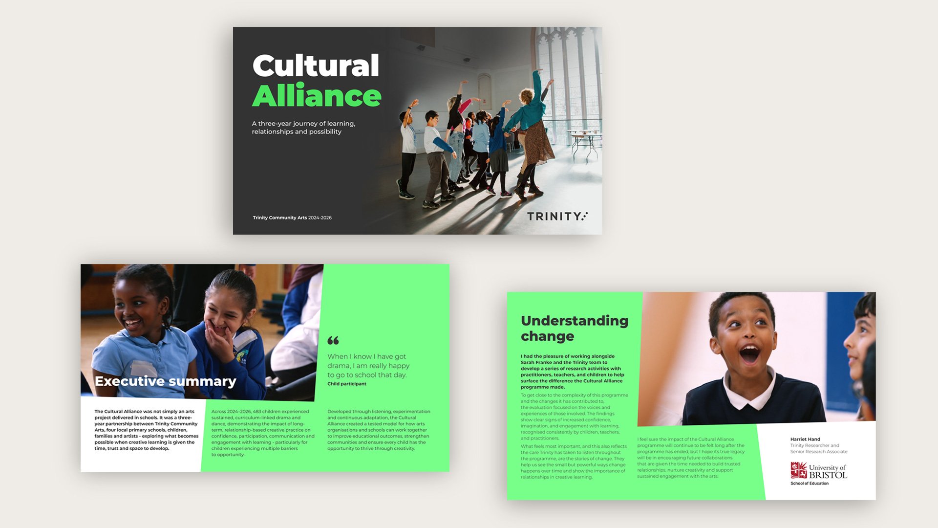
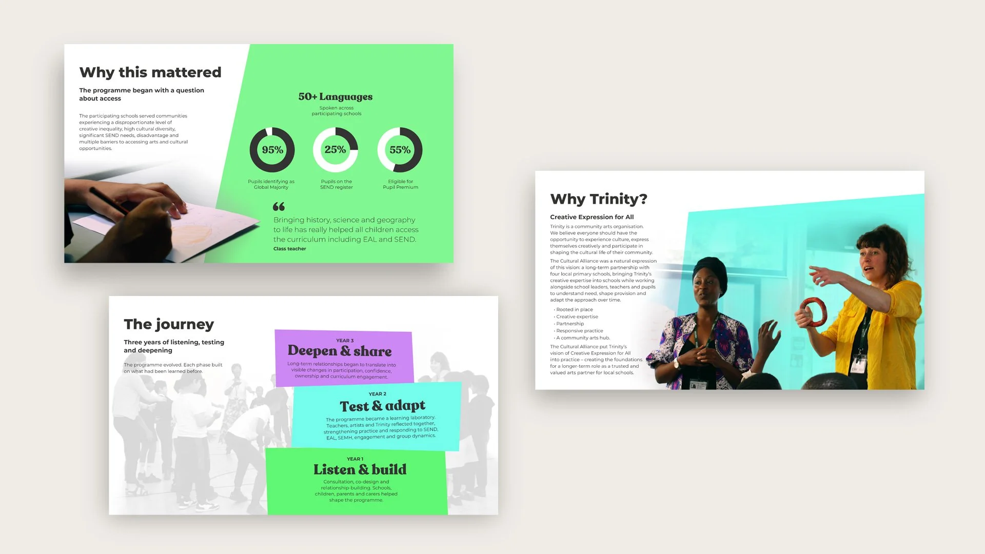
The presentation is given a fresh approach using high colour tone blocks and angled edges over a stable layout structure. Excellent photography of the children mixed with these elements helps to communicate the spirit of the programme.

The team gave me some good guidance about what they were looking for, and that I could stand on the Trinity brand but adapt it. We needed a mix of graphics and photography to get the messages across.

The main challenge was that photography was limited. The classrooms are busy, stimulating places so I needed to push back the backgrounds and this lifted out the main focal points of the story. To revise the branding I freshened the colours to modernise them.
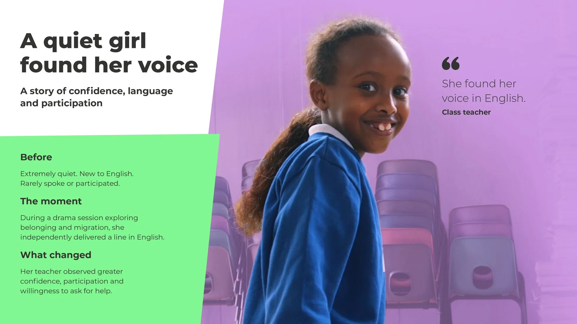
The structured approach, purple colour and beautiful photo of the student gives an emotional base to this case study about how a girl found her voice in English. The angled edges reflect the unique approach of the programme.
Some messages are graphically-led to give them more weight.
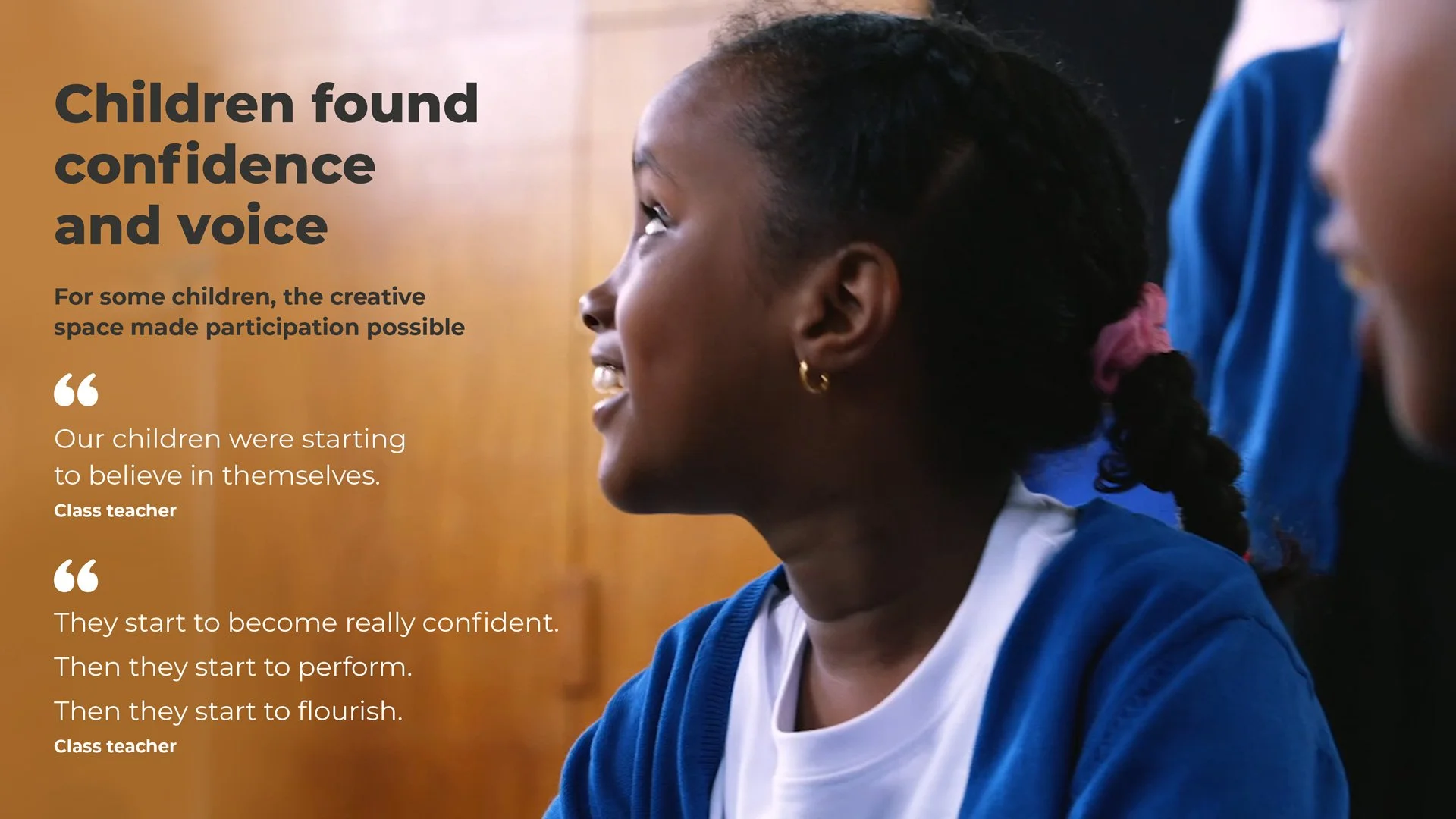
A full page image with clear quotes adds drama and emotion to the case study of a child who also found confidence and voice through the programme
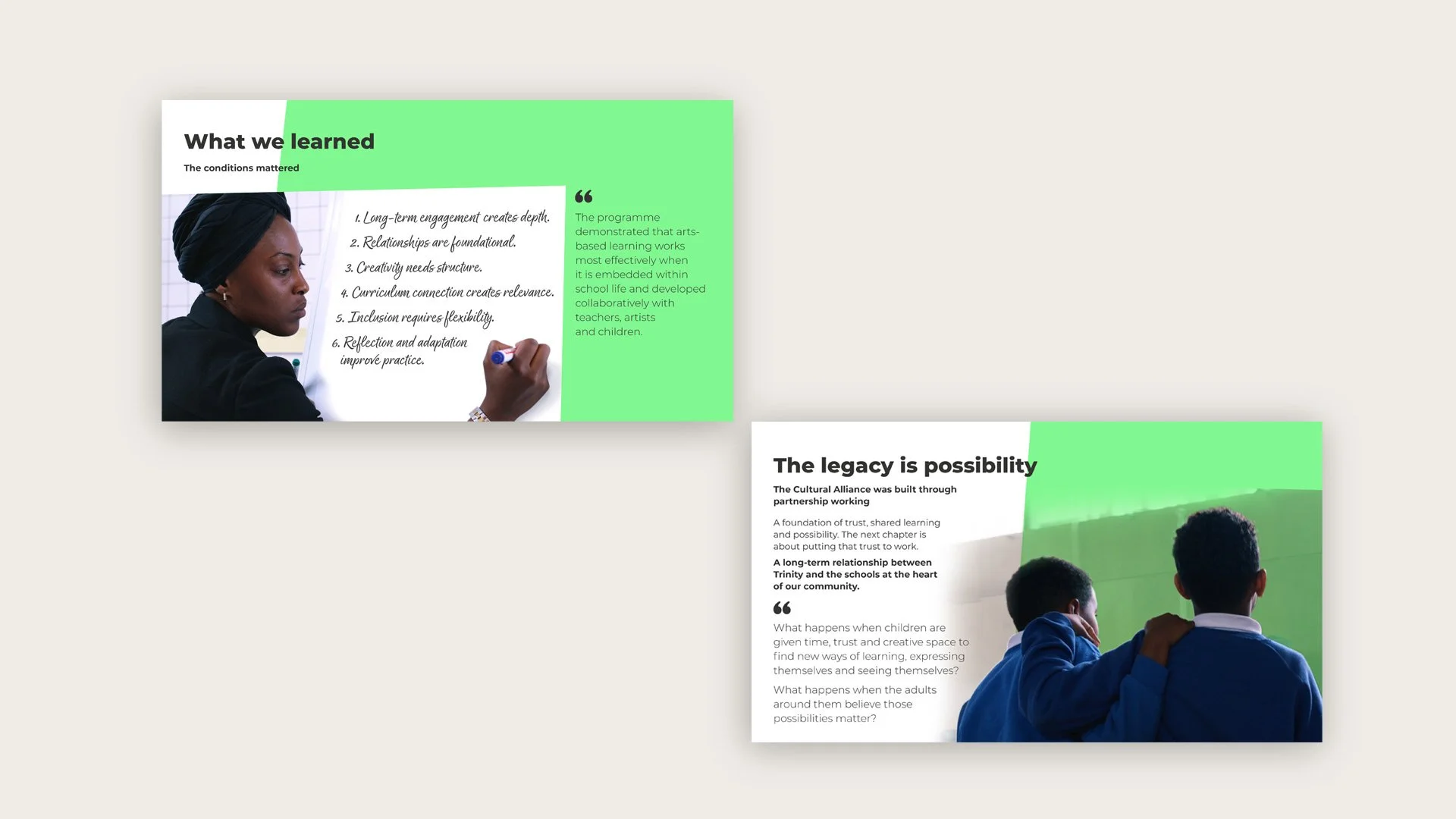
Graphic design that captures the spirit of the programme: here with one of the teachers writing on the board under the heading 'What we have learned' and the other showing two boys confident in showing their care and support for each other.
“It was a pleasure working with Diane on this project. She clearly understood the brief, captured the story and intent behind the project, and presented it in a way that was both accessible and engaging. It struck the right balance between being visually appealing and communicating the impact of our work. ”
— Adam Gallacher, Deputy CEO, Trinity

More case studies you might like